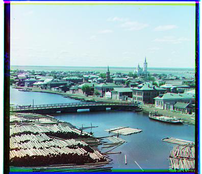
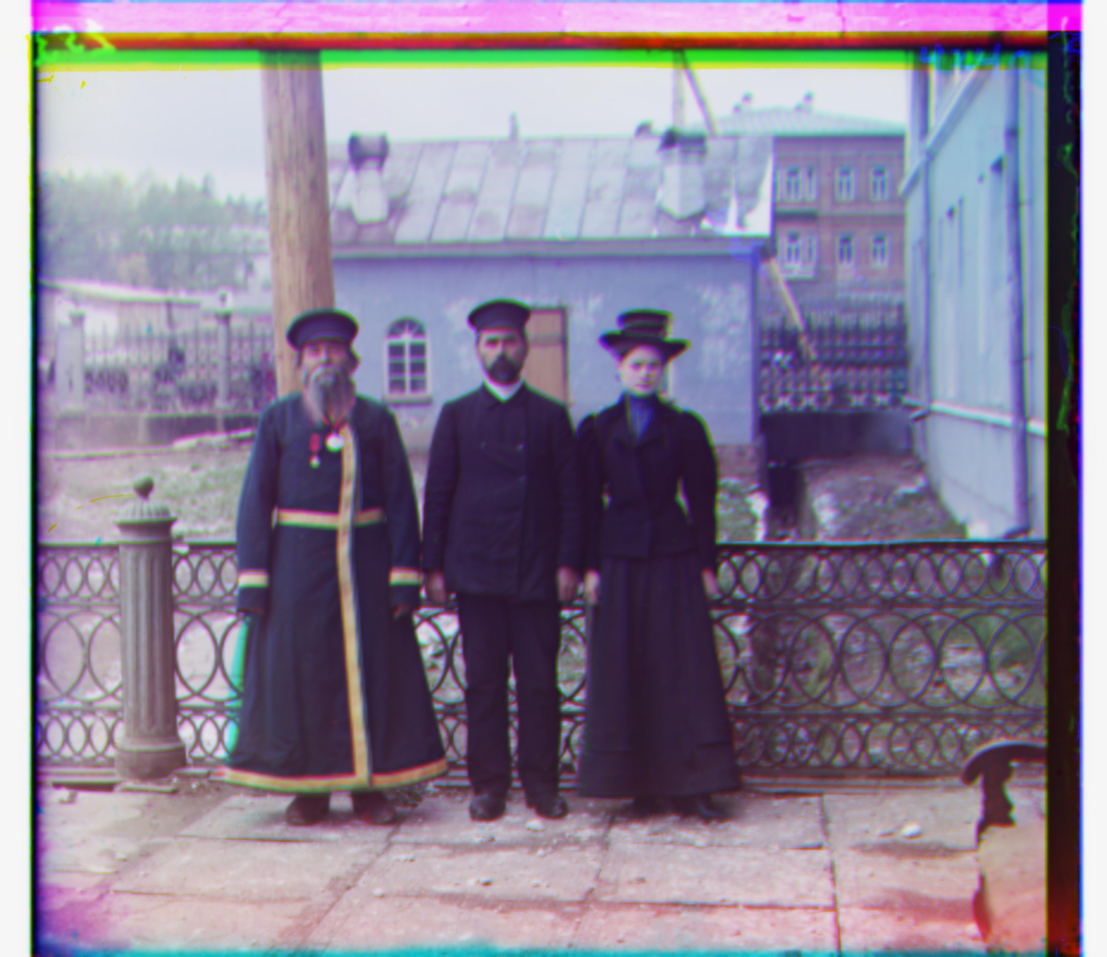
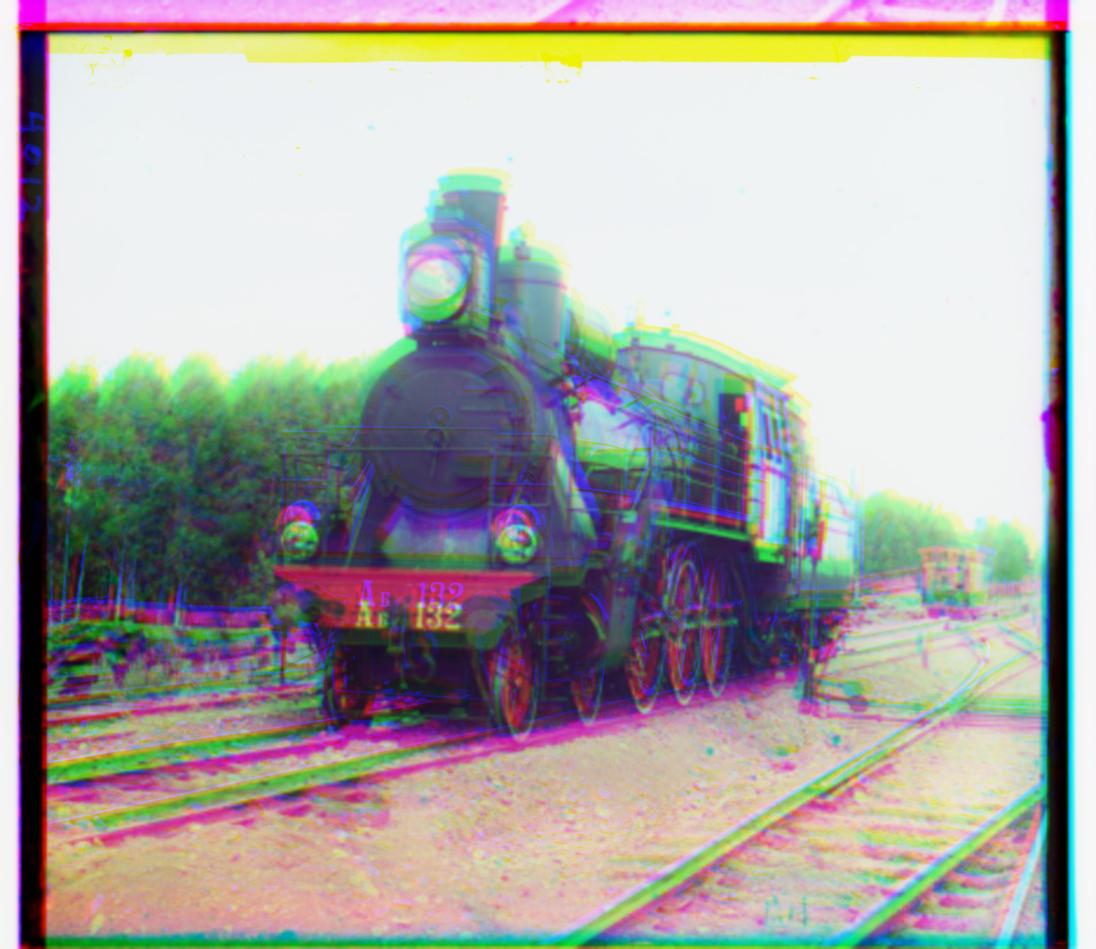
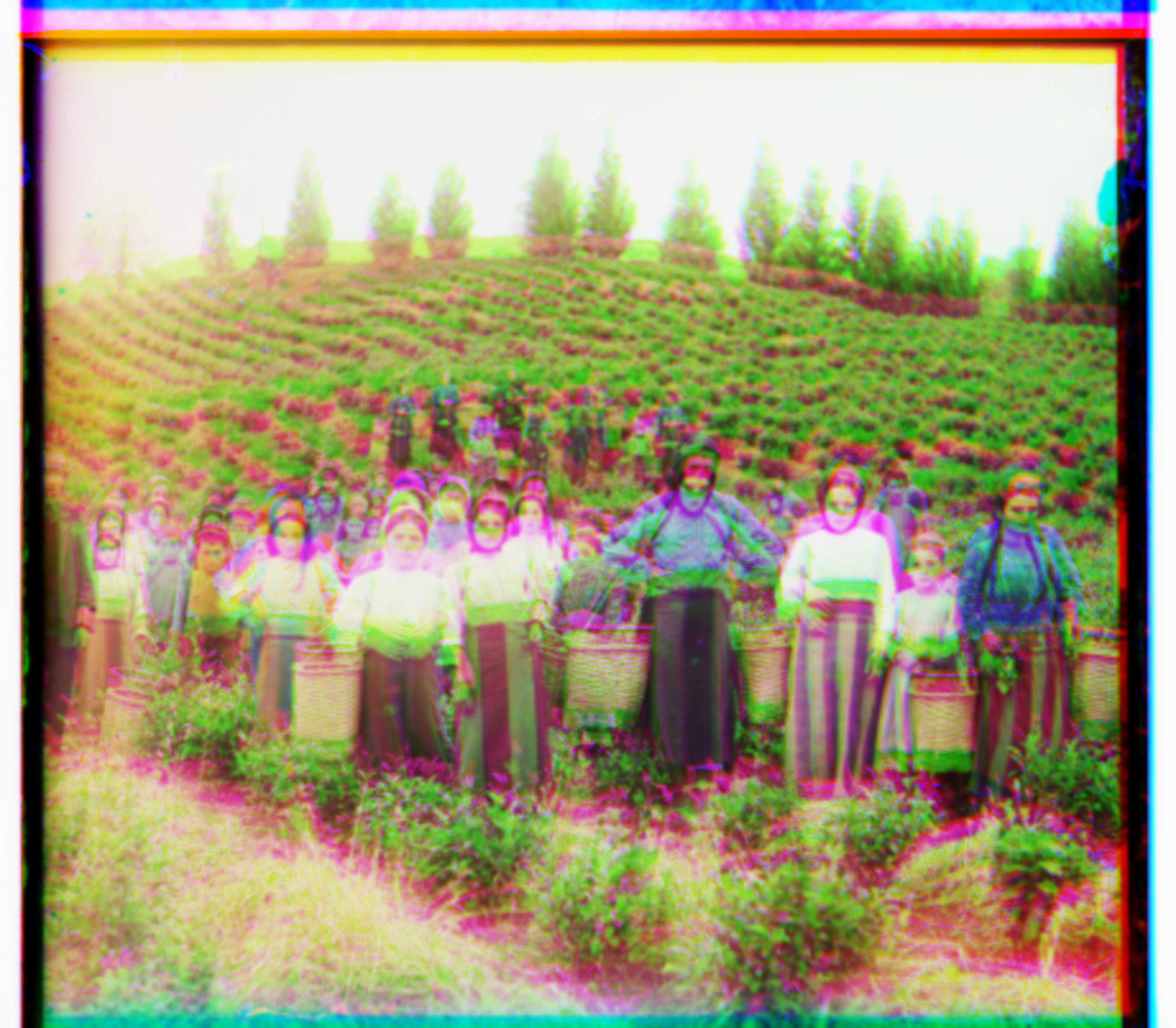
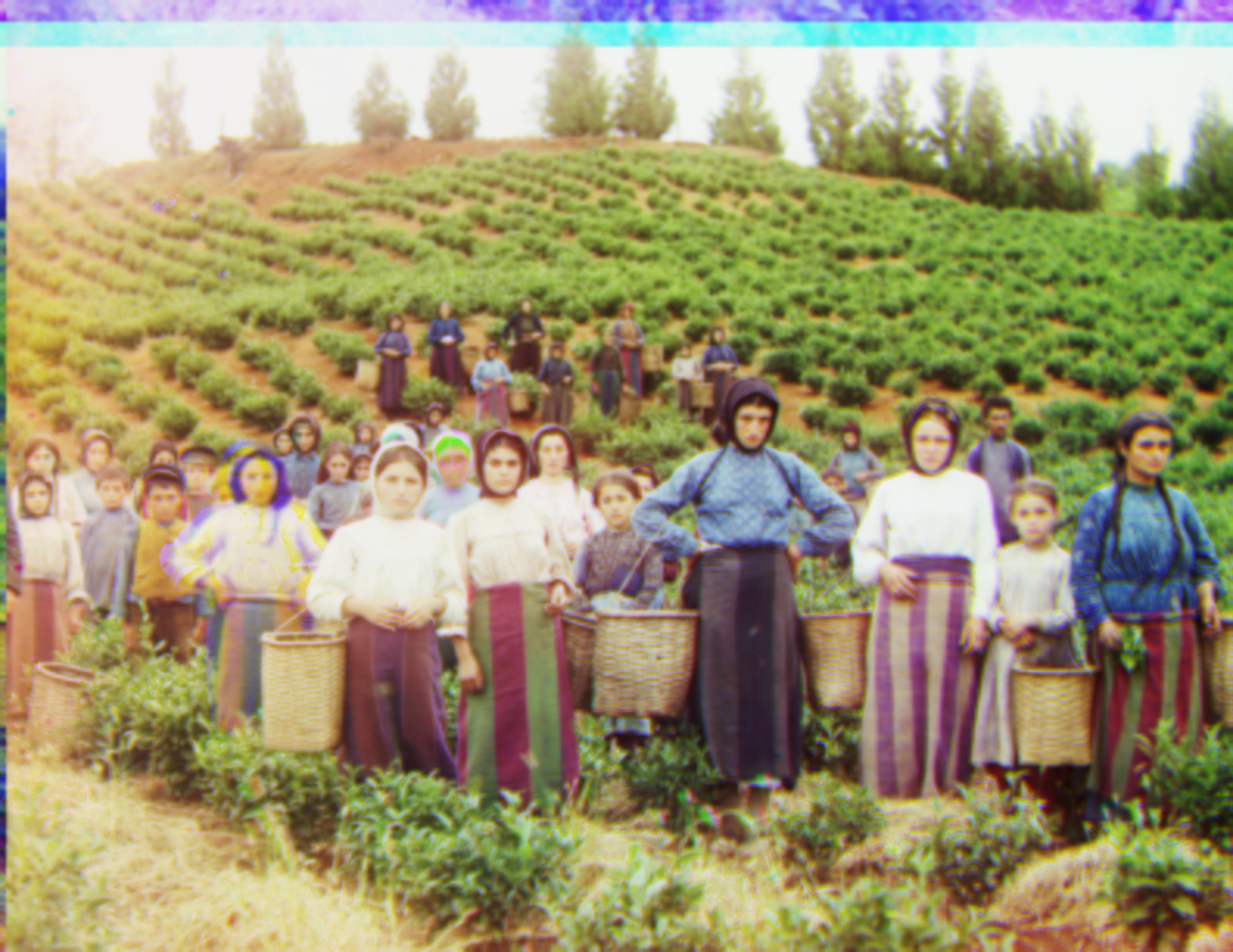
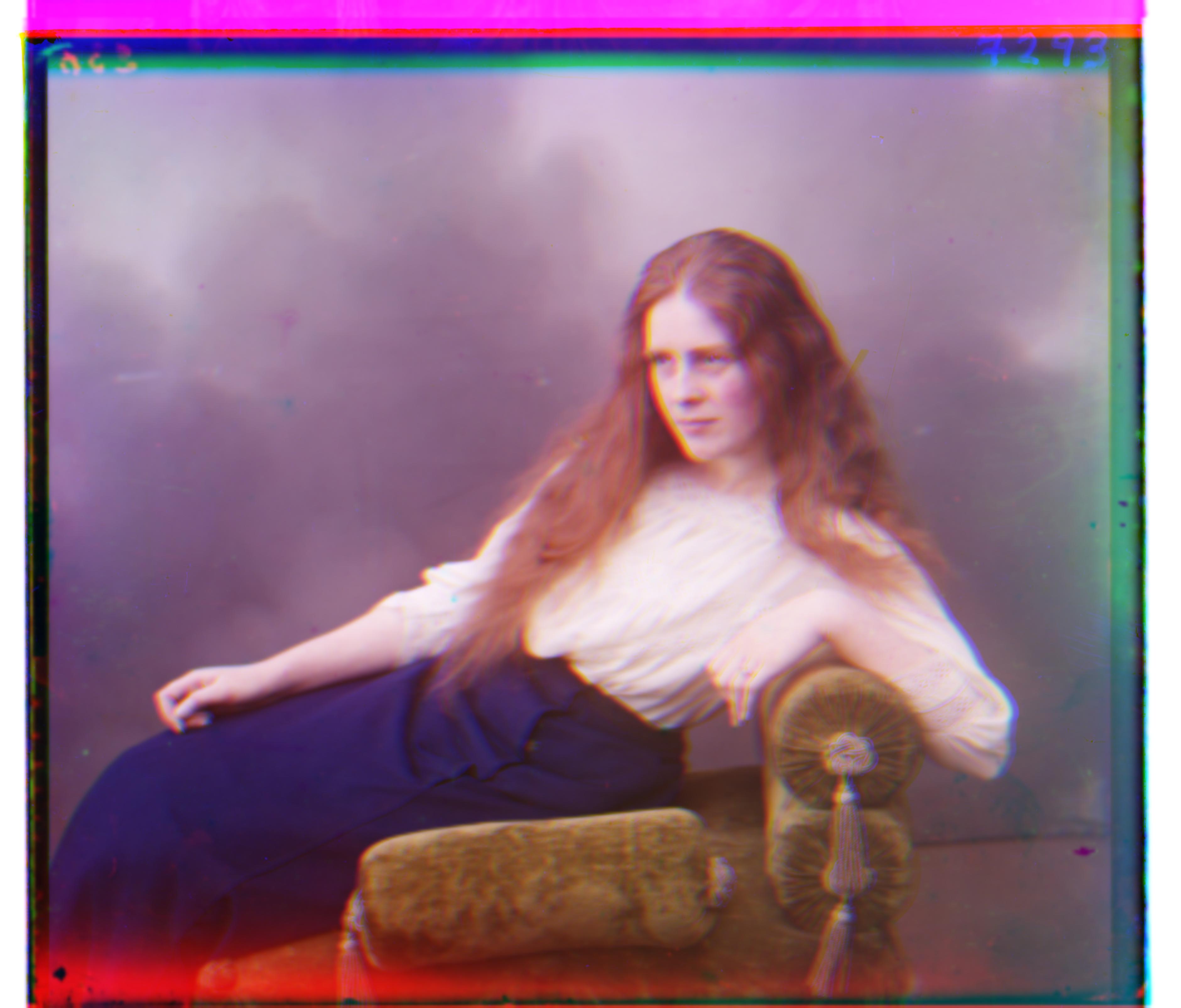
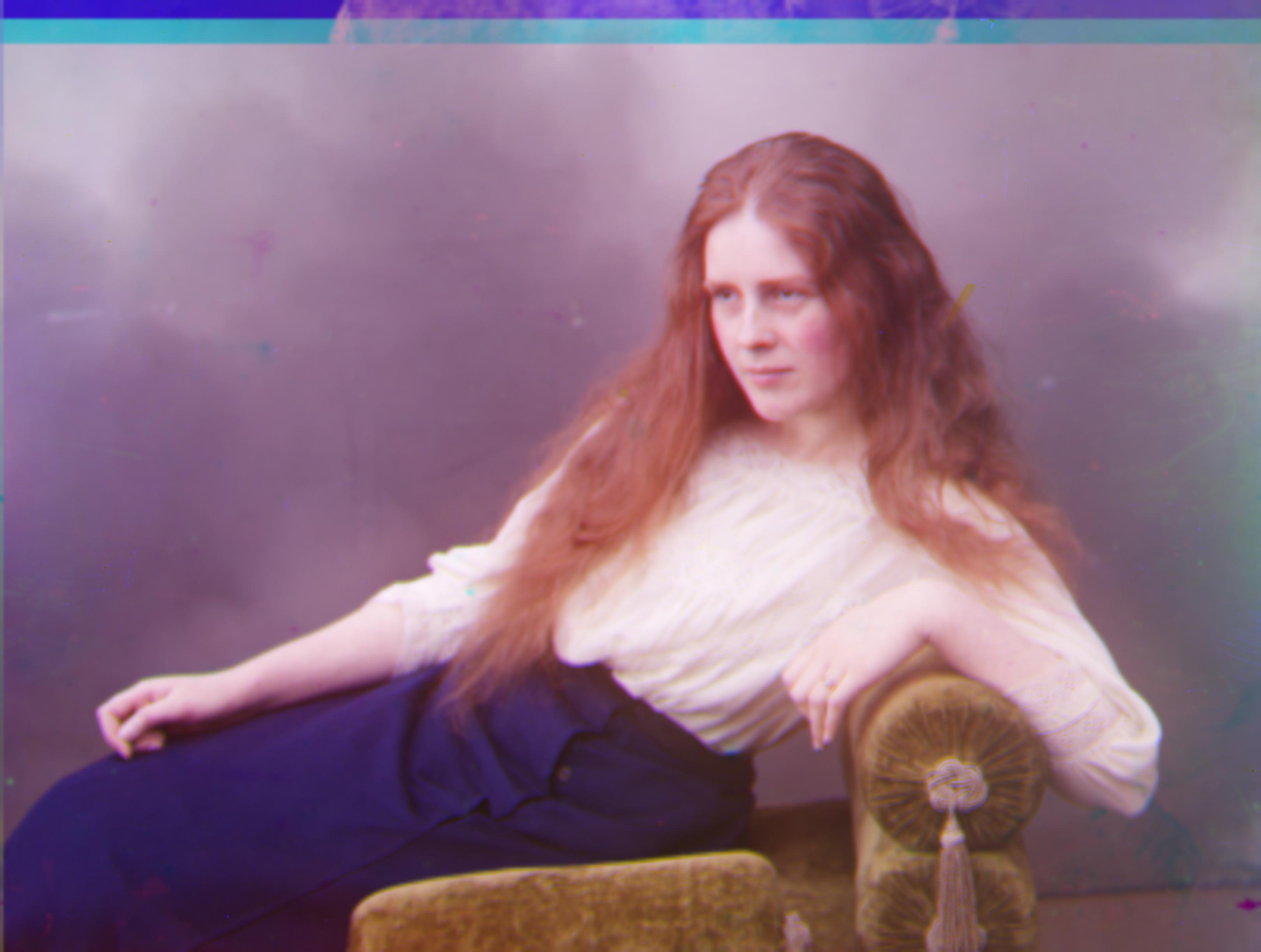
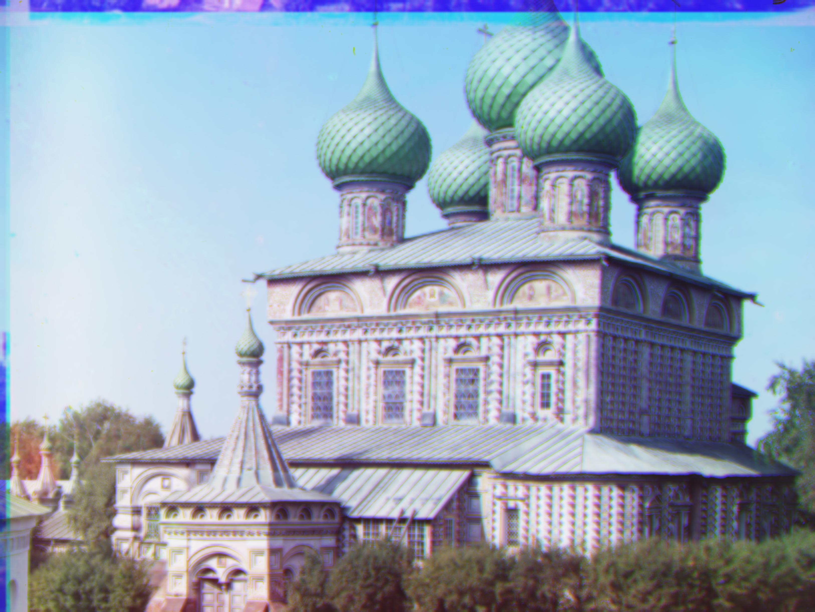
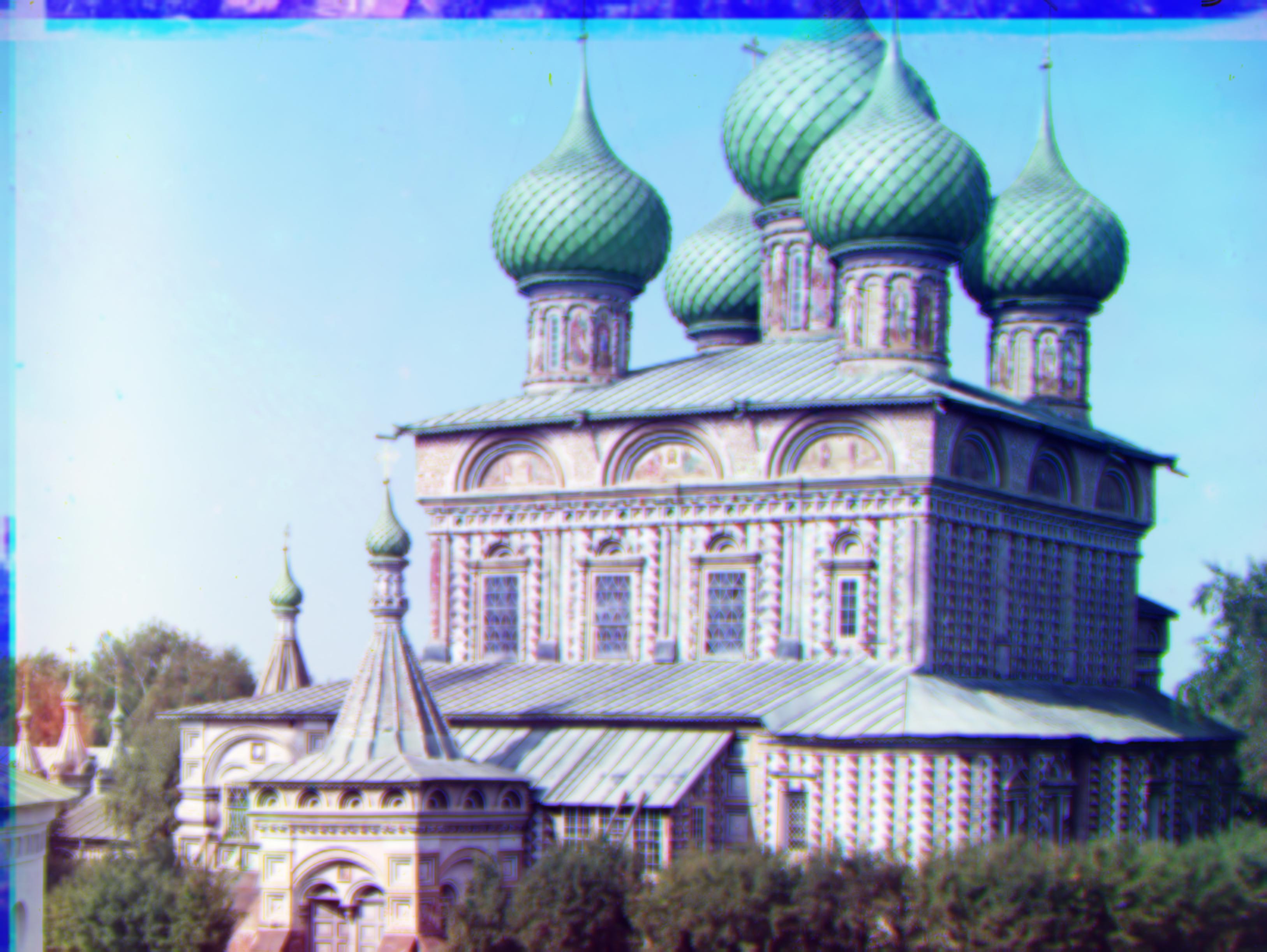
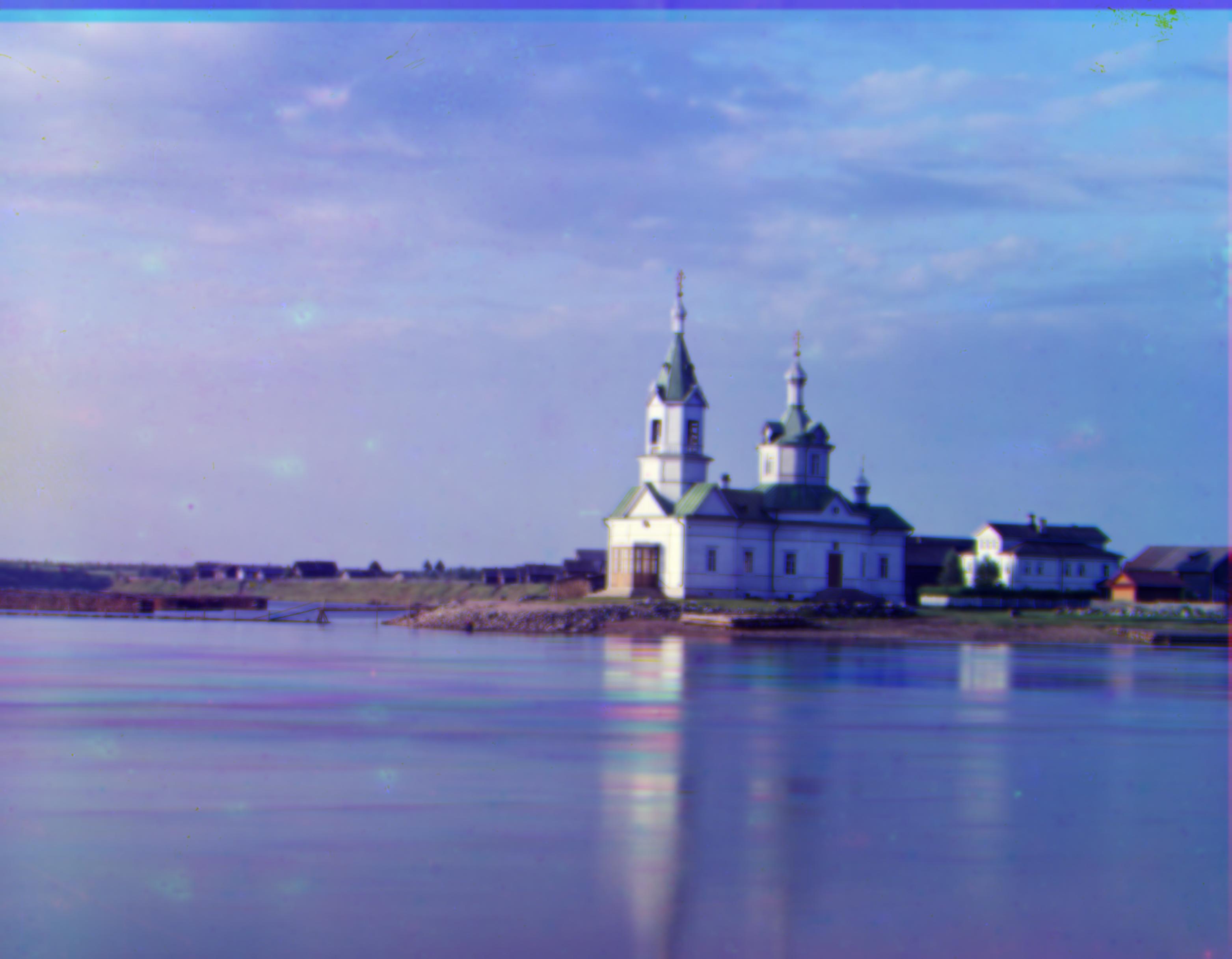
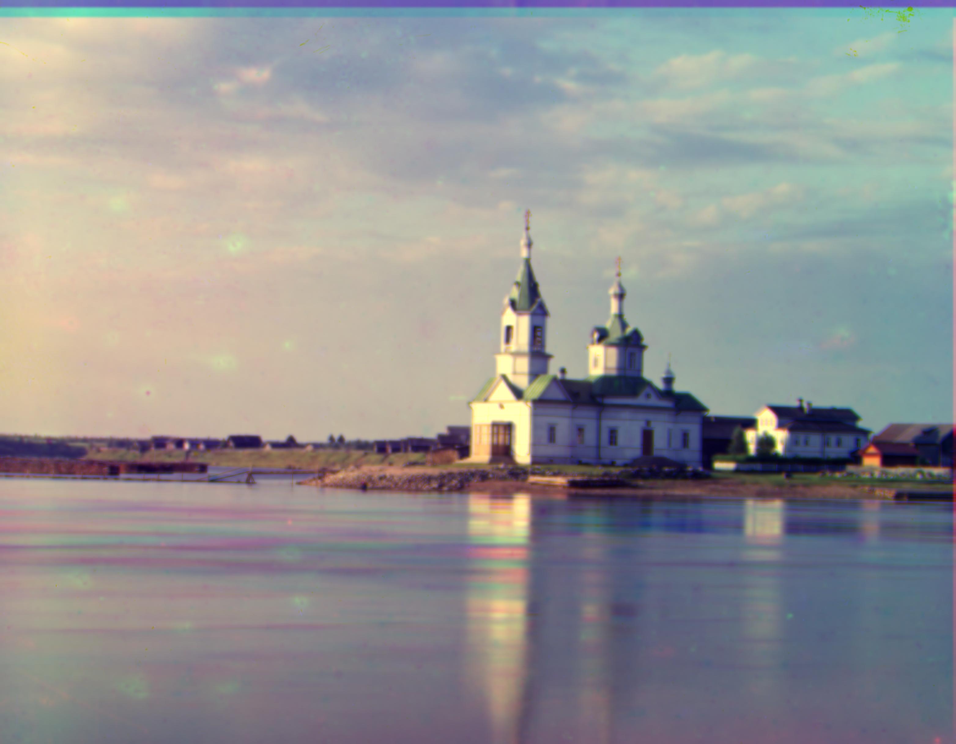
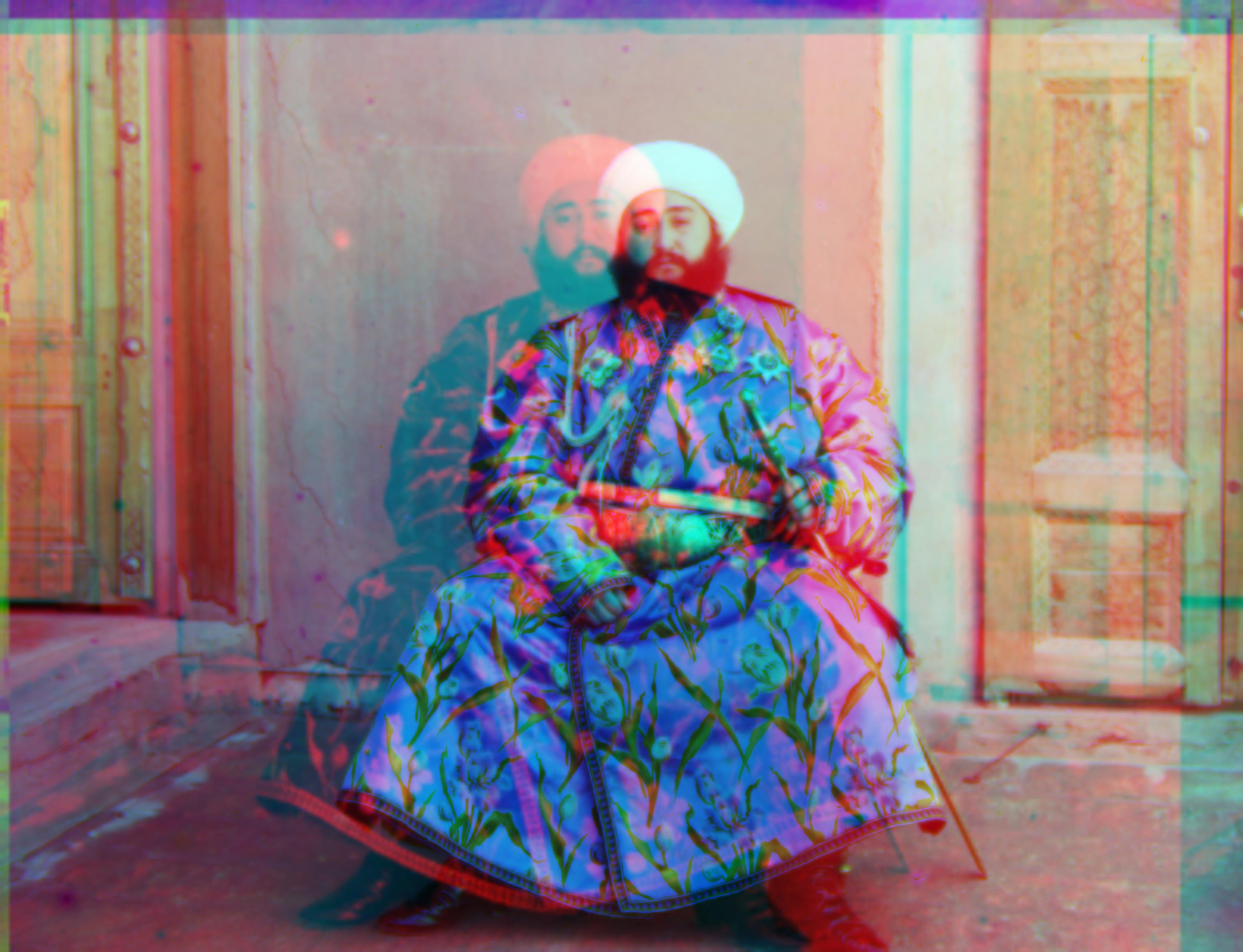
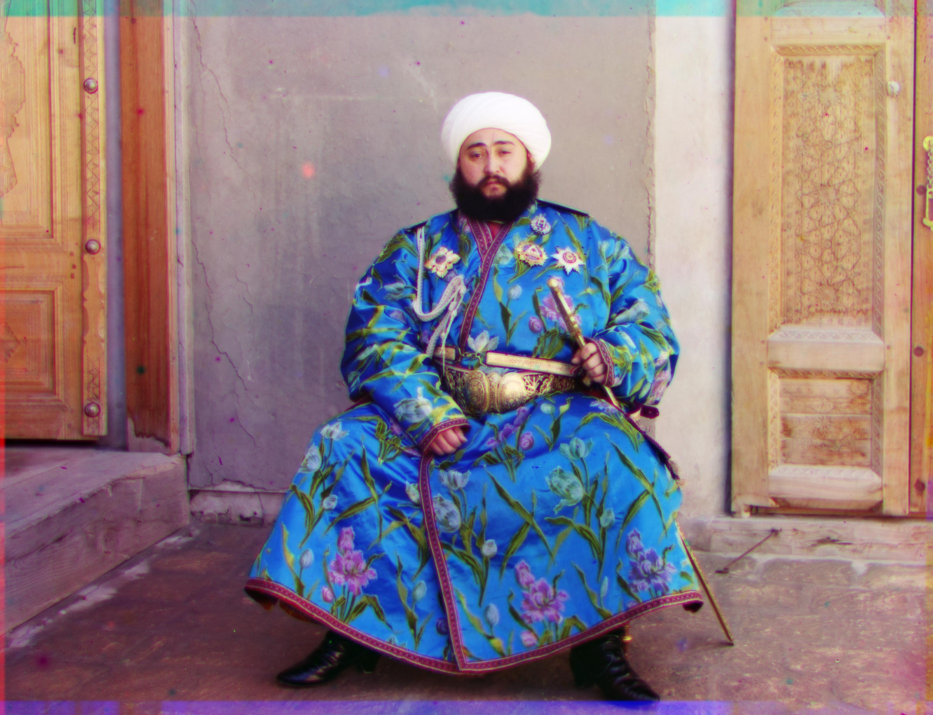
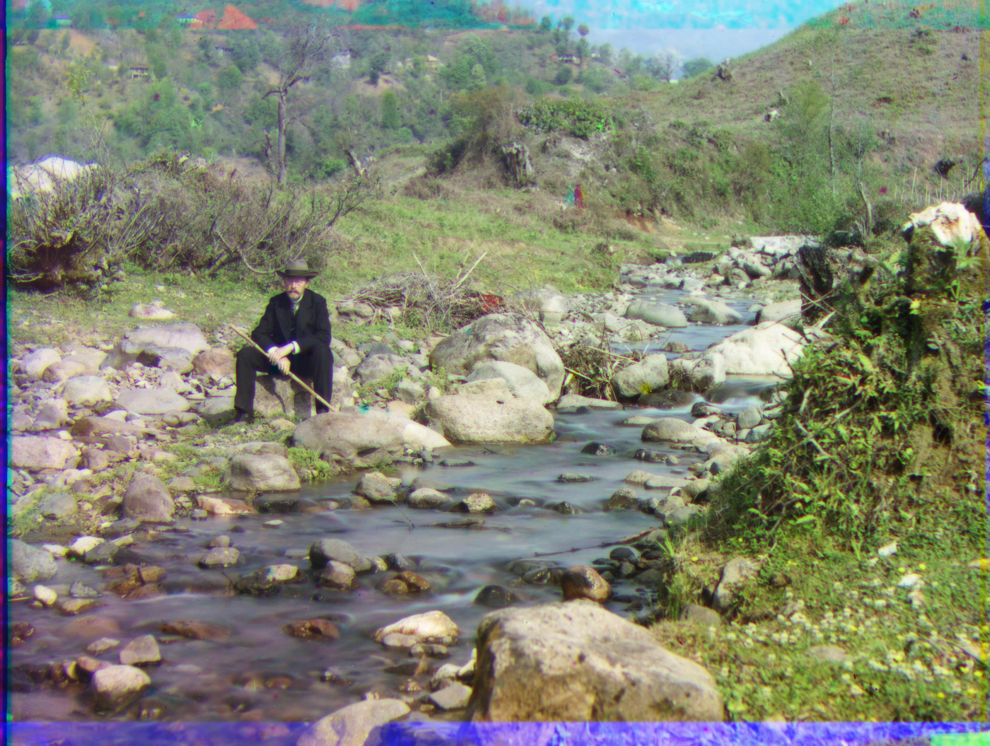
Sergei Mikhailovich Prokudin-Gorskii (1863-1944) was a pioneering color photographer. In 1907, he obtained special permission from the Tsar to travel across the Russian Empire and capture color photographs using a technique of recording three exposures on glass plates with red, green, and blue filters. He documented a wide array of subjects, including people, buildings, landscapes, railroads, and bridges, and even took the only color portrait of Leo Tolstoy.
Prokudin-Gorskii envisioned using his photographs in special projectors for multimedia classrooms to educate children about their country. Unfortunately, his plans were never realized as he left Russia in 1918 following the revolution and never returned.
In 1948, the Library of Congress purchased Prokudin-Gorskii’s RGB glass plate negatives, which capture the last years of the Russian Empire. Recently, the Library digitized these images and made them available online.
The goal of this project is to take digitized Prokudin-Gorskii glass plate images and, using image processing techniques, automatically produce a color image with minimal visual artifacts.
To align the image channels by RGB similarity, I exhaustively search over a window of possible displacements, score each displacement using an image matching metric, and select the displacement with the best score.
Why Euclidean Distance? I implemented both Euclidean Distance and Normalized Cross-Correlation. The results indicate that Euclidean Distance performs better in this context.
An image pyramid represents the image at multiple scales, typically scaled by a factor of 2. Processing is performed sequentially, starting from the coarsest scale and moving to finer scales, updating the estimate at each level. I used a recursive call to my original single-scale implementation. However, larger levels result in increased blur and information loss, so I opted for a smaller pyramid level.


Why Not Variance? Initially, I calculated the variance of each row and column to crop borders of white, black, or other colors. However, this method did not yield satisfactory results, as a single threshold was not applicable to all images.
Why Dynamic Margin? Given that the images are of similar size (taken with the same photographic equipment), I chose to use two margin factors and crop the borders dynamically.
The darkest pixel is treated as zero, and the brightest pixel as one. I then linearly map the image, resulting in visually pleasing results.
White balance involves adjusting the average color in each channel to grey, and the average color in the whole image to neutral grey. However, since the images are light-balanced, adjusting the average color to grey resulted in a greyer overall image.
I Did Not Apply White Balance
Why Blue Base? Given the blurriness of the images, I explored other methods to enhance image quality. I came across the awarded homework by Saurav Mittal, which suggested "Base Channel Selection." Based on this, I initially chose green as the base channel.
Why Green? Saurav Mittal explained that "green provided consistently good results for all images". However, I sought a more comprehensive explanation and found a biochemical rationale: "When fully light-adapted, the human eye features a wavelength response from around 400 to 700 nanometers, with a peak sensitivity at 555 nanometers (in the green region of the visible light spectrum)...... Light scattering and absorption by elements in the crystalline lens contributes to a further loss of sensitivity in the far blue."
This explains why green is chosen as the base channel.

Why RGB-Based Alignment? Some dazzling strips remain, which suggests that the alignment method may be at fault. RGB-based alignment is sensitive to both color and light. Given that the project website offers gradient-based and edge-based methods, I chose the gradient-based method due to familiarity with the relevant mathematics.

| Parameter | Value |
|---|---|
| Displacement | 20 |
| Level | 3 |
| Scale | 2 |
| Margin Height | 0.12 |
| Margin Width | 0.07 |